Much [and often deserved] fun has been had at Microsoft’s expense with regard to their incomprehensible dialogs. Examples can be gathered from the Daring Fireball blog (for example, this one). But what of Mac OS X? To answer the question posed in the title of this blog, Mac OS usually does better, but take a gander at this iCal Sync warning that popped up yesterday:
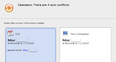
How exactly is one supposed to resolve this “conflict”? In the first place, it is not clear what the conflict is! Both entries look the same (the blocked out text is the name of a family member and is the same in both cases) as far as I can tell.
Worse, what do the two columns represent? One is titled “iCal” while the other says “This Computer”. What are we to make of this distinction? iCal is an application running on This Computer! In fact the only application that has calendar entries.
I suppose the “parent event:”, present only in the left column, holds the key to this conflict mystery, but what it means is as opaque as the rest of the alert.
This is one example among the many failings and confusions of Mac OS X (here’s another: say you change an entry with invitees, often unintentionally by mistakenly dragging it, iCal insists on updating the invitees providing no option to undo the action without consequence) and they seldom excite the sort of ridicule that Microsoft suffers. Someone should report this to the authorities.
