Not to worry, this is not a post about politics, but about design (I am an expert in neither field). You have probably grown tired by now of reading this popular quote attributed to Steve Jobs, but it’s worth repeating:
Most people make the mistake of thinking design is what it looks like. People think it’s this veneer – that the designers are handed this box and told, ‘Make it look good!’ That’s not what we think design is. It’s not just what it looks like and feels like. Design is how it works.
You only need look at the design convulsions of Ford and GM over the last 10 years (in particular the various retro models) to see that most design is either adding more and more lipstick on the pig or worse, adding fluff to a product (or presentation: think colour gradients in text boxes in PowerPoint slides) that makes it less usable.
Take this example from my workplace. Up until a few months ago, we had a water cooler that looked like this:
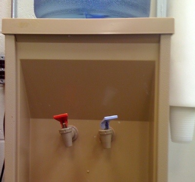
Picture 1
A fairly straightforward affair, with hot and cold water indicated clearly by colour, and no ambiguity on where the water comes out. This unit was replaced with the slicker one below (let’s call this picture 2):
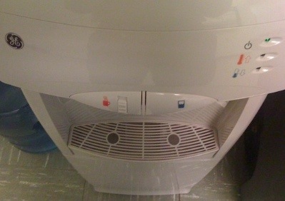
Picture 2
Any guesses on where the water comes out? That’s a valuable bit of knowledge when you want to use the hot water! Perhaps the water is dispensed from a point below the red and blue markers? Or atop the circular holes on the base filter? If you guessed either of these not only would you be wrong, but you would be wrong in a dangerous way (let’s call this picture 3):
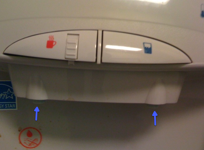
Picture 3
As you can see from the above picture, if you were to position your cup below the red icon or the circular hole on the base filter, the hot water would in fact pour out a bit to the left of your cup (blue arrow(s) added by me), most likely on to your hand. Note that only the coloured icons and the base filter are visible from the top (Picture 2), your view when you are filling water at the cooler.
It is not clear to me if there is some usability testing that is performed at GE before these products are released. But what seems likely is that the function (“how it works”) is a somewhat distinct process, at GE, from the form (“how it looks”).
