No RIP for RIM
January 17th, 2012 by ravi

Everyone and his dog has now opined on how RIM – maker of Blackberry mobile phones, once standard accessory with power suits – can reverse its current death march. Abandon the quaint co-CEO setup. Run Windows Phone OS. So on. The suggestions are plenty. And now there is talk of acquisition.

Better, I think, Michael Dell’s advice to Apple: return the cash to shareholders (RIM was recently trading below its book value!), give employees a good severance package (that’s me, not Dell), and let it sink to rest for it was never meant to float. For RIM was built on two premises, both false.

Read the rest of this entry »

Google’s new design/experience: taking Chris Wiggins to heart
June 29th, 2011 by ravi

Google has progressed since the days of 41 shades of blue. At least in the user interface of their products. I had no insight into whether this reflects a change in the underlying process. But now there is some news on that front. Yesterday Chris Wiggins (Creative Director at Google) made a post to the “Official Google Blog” to explain the “new and improved Google experience … founded on three key design principles”: Focus, Elasticity, Effortlessness. I think the man, and the company, are serious, and I sincerely applaud them for it and wish them well.
Read the rest of this entry »

The user is the consumer is the employee is the enterprise
November 10th, 2010 by ravi

Three year olds are clever people. Take the example of my son who vehemently resisted our pleadings to ingest more food: “My stomach is full. There is just no place left for any more food”. But his resistance turned to enthusiasm when, just a few moments later, some ice cream made an appearance. Upon being reminded that by his own admission his stomach was out of room, he scoffed dismissively: “That’s my stomach for food. Ice cream goes into a different tummy“.

It is less humorous and hardly clever when a corporation adopts this line of defence. Nevertheless, time and again, this is the very approach employed by corporations both vending products and selecting them. Like most subterfuges the effect is achieved through wordplay, in this instance the [mostly] false dichotomy created using the words ‘consumer’ and ‘enterprise’.
Read the rest of this entry »

BumpTop and UI paradigms
January 22nd, 2010 by ravi

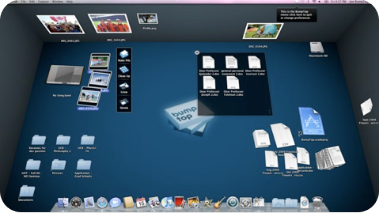
BumpTop is a 3D desktop manager for Windows and Mac with some slick features and fairly well done OS integration. I have been using it for a few days now and it is impressive if not indispensable. The reason for this post however is to comment on something that John Gruber wrote about this app:

And the 3D stuff, with a weird perspective on “walls”, just seems silly.

I can see how he may find it silly, but in my usage I found the walls quite a useful feature, psychologically speaking. Despite the large collection of useful widgets on my Mac OS Dashboard, I rarely bring up the Dashboard to access the information or operation that these widgets provide.

Why not? Apart from the fact that the Dashboard takes forever to update, somehow, bringing up the Dashboard, visually an overlay on my desktop, seems to neither fit into my workflow nor appeal to my instinctive usage patterns.

On the other hand, in the few days I have been using BumpTop (intermittently), the ability to create sticky notes on a wall (admittedly, a particular application, and not a replacement for the Dashboard) has resonated well with my impulses… to look for a note on a wall seems, well, just the right thing to do!

It helps that BumpTop causes no increase in CPU utilisation on a quiescent system or when I working primarily within one application.

I am not sure if I will stop using Qu-S and keep using BumpTop, but it would be interesting to know what those who study UI/UX design think about the ideal way to present informational widgets and tiny apps.

SIDEBAR
»
S
I
D
E
B
A
R
«
»  Substance: WordPress  »  Style: Ahren Ahimsa